Deutsch
 Français
 Türkçe
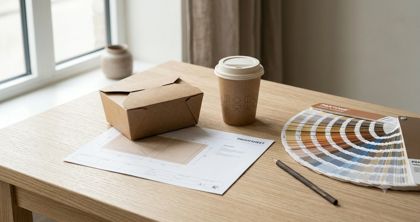
You send the logo across, expecting the job to be booked. Instead the reply is a set of questions: is that a vector file, which of those two reds is the brand colour, and is anything meant to print on the inside? For most independent food businesses this is the first sign that printing packaging is not the same as printing a menu. It is a good sign, actually. The suppliers who ask nothing are the ones whose first delivery surprises you. Here is what sits behind those questions, from the production side, so your first run lands the way you pictured it.
Why brown board changes your colours
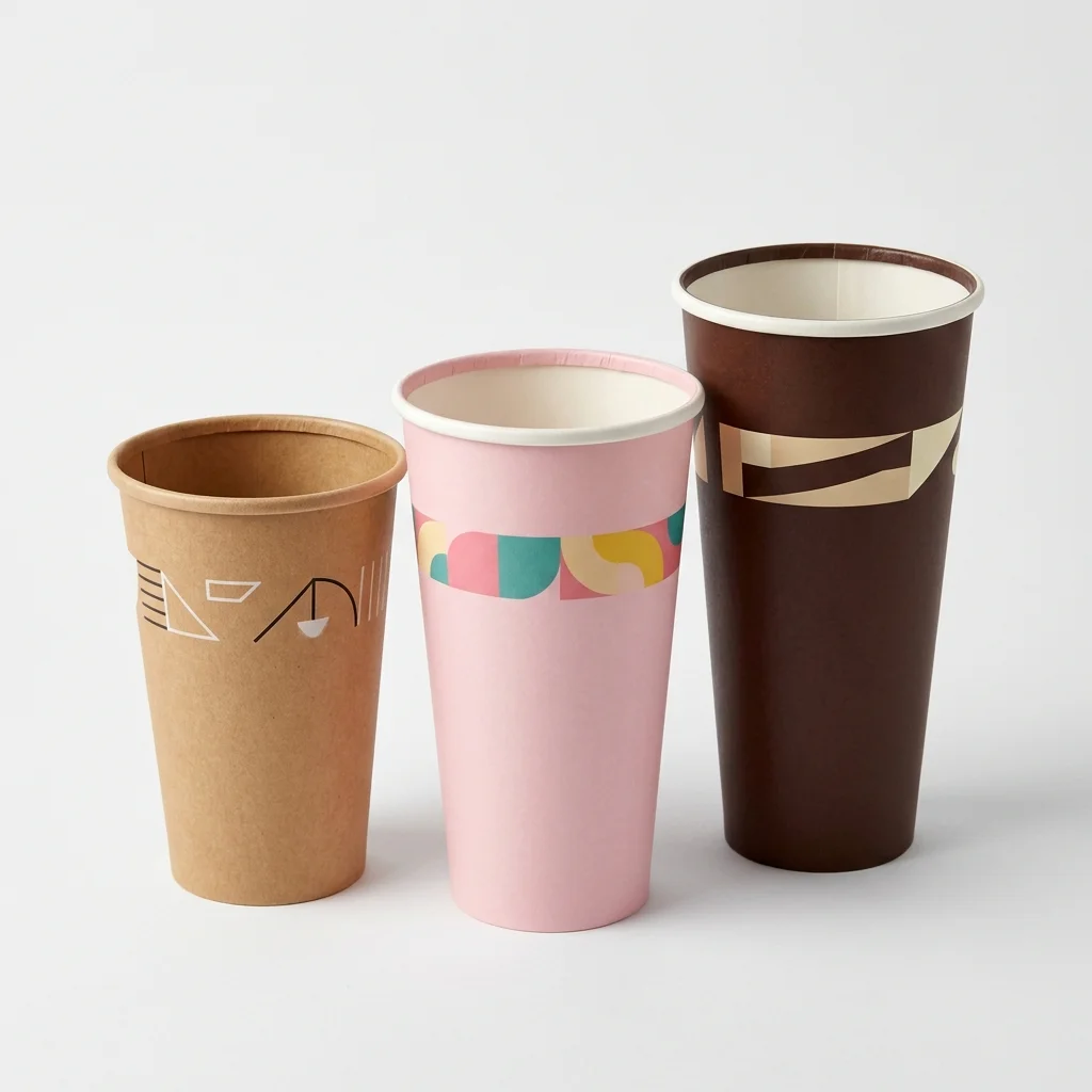
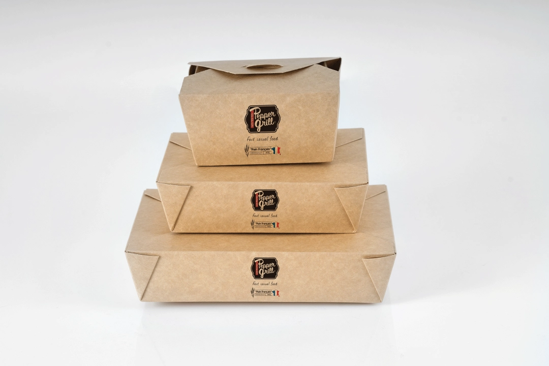
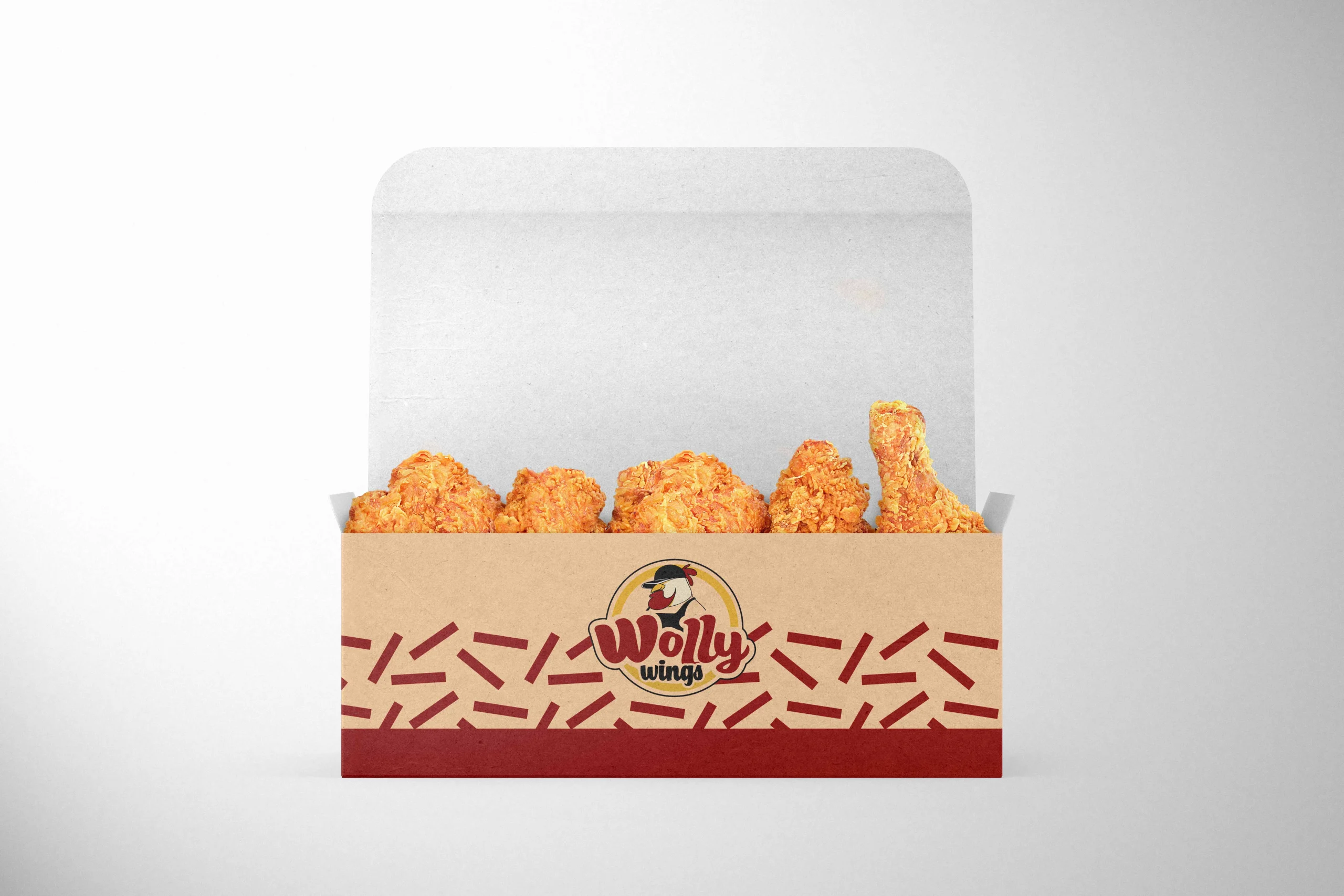
Office paper is white; kraft board is not, and that single difference explains most of the disappointment we see. The brown base shifts every colour printed on it: tones read warmer, darker and less saturated than they look on screen. A confident red drifts towards earth, a pale blue loses its lift, and pastels almost disappear. White is not an ink in standard printing, so wherever your design shows white, the board colour stays unless a special opaque white is specified. Black behaves differently too, since a flat single black looks weak and greyish on uncoated brown, which is why printers build a richer black from several inks.
None of that limits your brand; it just changes the design decision. Artwork that works with the material rather than against it looks better on kraft: clean shapes, solid areas, one or two colours. If a crisp white look is essential to your identity, coated white board is the honest answer, and that choice is really a material decision rather than a printing one.
What stays off the food-contact side
Here is the point that surprises buyers most often: printing goes on the outside. The surface touching your food normally stays unprinted, because components of printing inks can migrate into food under unfavourable conditions. Low-migration ink systems designed for inside printing do exist, but they are a deliberate technical choice with their own documentation rather than the default of a standard order. A supplier who offers inside printing without asking a single question about your product is not being helpful.
In practice, keep your artwork outside and make sure the supplier can tell you which ink system is used and that the declaration of compliance covers the finished printed item, not just the plain board. We set out what that document should contain in our guide to what food-safe packaging actually means on paper.
The file: where jobs actually get stuck
Four issues repeat in prepress. Fonts that were never embedded and get substituted on the production machine. Logos pulled from a website as small images instead of supplied as vectors from the original. Colours built for screen that have to be converted for print, shifting the tone in the process. And elements sitting too close to a cut or fold, so they look clipped once the pack is made up. None of these is dramatic when caught before printing; every one of them costs a run when caught afterwards.
Your preparation is short. Ask your designer for the open file plus a PDF with fonts embedded or converted to outlines, get the logo as a vector, and decide which brand colour is the binding one so the printer can set it properly. Fine lines and very small type deserve a little more weight on uncoated stock than they need on your menu.
A proof settles what a screen cannot
Monitors emit light; board does not. The only reliable comparison is a proof on exactly the material you are ordering: same board, same coating, same size. Hold it under your shop lighting, put the product in it, photograph it on your phone, because that is how your customers will meet it. Anyone serious about brand colour signs off on a physical proof rather than a screen. In our experience this single step prevents more complaints than any promise written into a quote.
Finishes look good and cost twice
Gloss varnish, lamination, embossing: visually they can add a lot, with two side effects. They raise the unit price, and they can reduce recyclability, since extra layers complicate fibre processing. As fee systems move towards modulation, where harder-to-recycle packaging costs more, the plainer option is increasingly the cheaper one on both lines. We worked through how that arithmetic lands in our piece on who actually pays packaging EPR. For most food businesses the honest recommendation is simple: a clean one or two-colour print on good board reads as more premium than a full gloss laminate that shows every fingerprint from the counter to the customer.
Less coverage, more effect
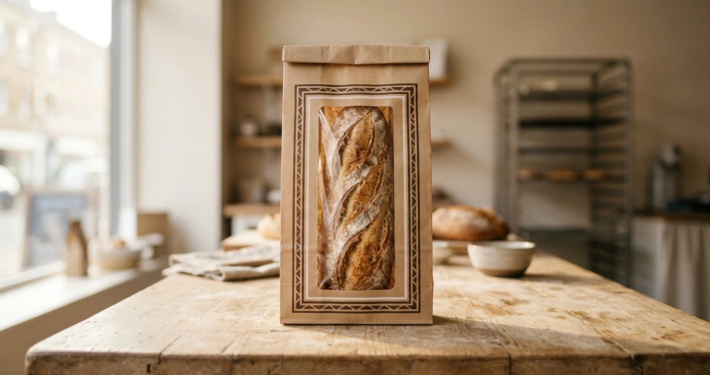
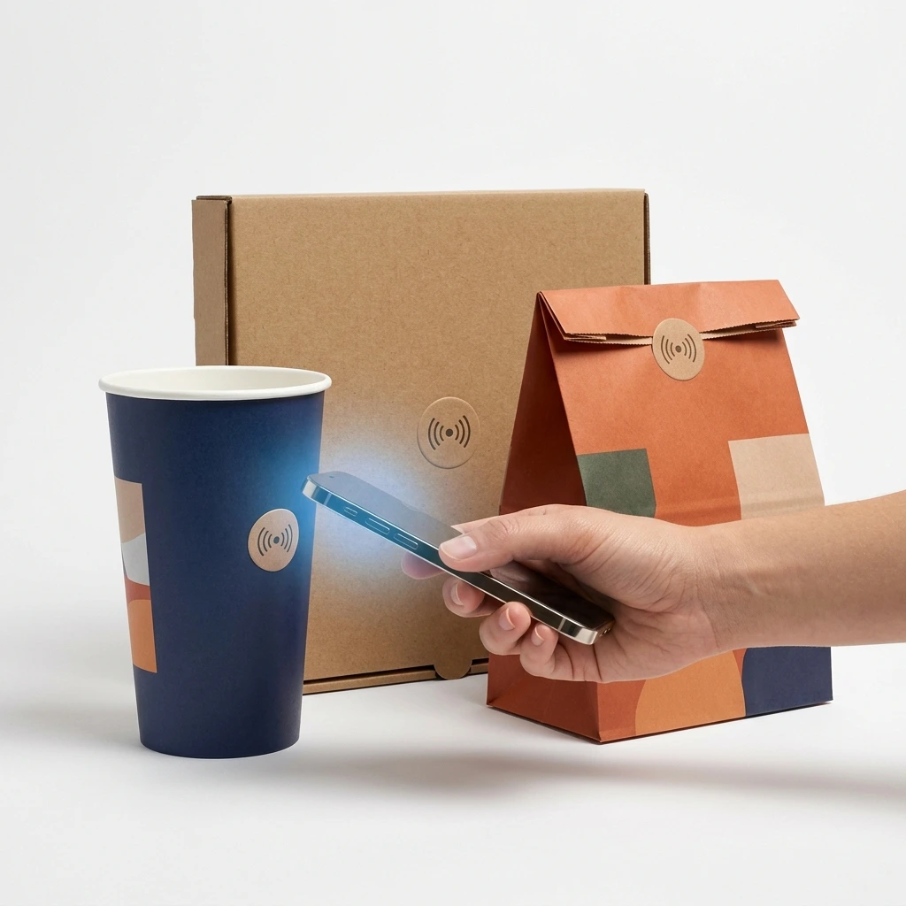
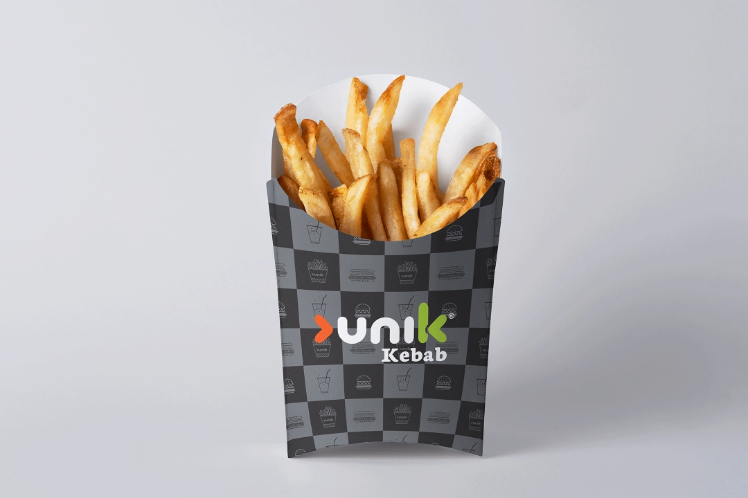
Full-bleed printing is rarely the strongest answer. A well-placed logo on unprinted kraft looks calmer, suits the material and costs less than flooding the surface with ink. If you print several lines, one shared element does more than five different designs: the same motif across cups, food boxes and bags reads as an identity and simplifies production, because fewer separate print setups are involved.
Print methods, in a minute
You do not need to become a printer, but two ideas save money. Part of the cost of any print job sits in the setup rather than in the individual item, which is why the price per unit falls as the run grows and why every extra design adds a fixed cost of its own. That is where well-meant plans quietly go wrong: four seasonal variants on a first order can cost more than a larger run of one good design. Digital printing usually suits smaller quantities and short lead times, while traditional methods come into their own on longer runs where the unit price keeps dropping. A supplier worth keeping will tell you which side of that line your quantity sits on, rather than selling you the method they happen to prefer.
Cutting and folding need room
Packaging is not a flyer. It gets die-cut, creased and folded, and something happens to your artwork at every one of those edges. Wording that looks centred on a flat drawing can wrap around a corner once the pack is made up, and a line placed hard against the cut line reads as uneven afterwards, because board carries small tolerances through the cutting stage. Prepress works around this with safety margins: important elements move in from edges and creases, while background areas are extended past the trim so no unprinted sliver shows after cutting. Give your designer the die-line for the actual item rather than a generic rectangle and this problem disappears before it starts.
Checklist before you approve
- Is the artwork a vector file, with fonts embedded or converted to outlines?
- Have you named the binding brand colour, and has it been set for this material?
- Does the food-contact side stay unprinted, and does the compliance paperwork cover the printed item?
- Have you seen a proof on the board you are actually ordering, not just a screen render?
- Do you genuinely need the finish, and what does it do to price and recyclability?
One honest limit to close on. Good printing does not rescue the wrong pack. If the box is too tight for your portion or the cup cannot hold your service time, no artwork will save it; get the product right first, then the picture on it. The cheapest proof you will ever buy is the one you look at before the run, not the one you piece together from complaints afterwards.
Frequently Asked Questions
- Why does my brand colour look different on kraft packaging?
- Because the base is brown rather than white. Colours read warmer, darker and less saturated on kraft, and white is not an ink in standard printing, so it stays board colour unless an opaque white is specified. A proof on the ordered board shows you the real result before the run.
- Can the inside of the packaging be printed?
- Normally only the outside is printed, since ink components could migrate towards the food. Low-migration systems made for inside printing exist, but they are a deliberate technical choice with their own documentation rather than a standard option, so treat an unqualified yes as a warning sign.
- What file should I send my supplier?
- A PDF with fonts embedded or converted to outlines, plus the logo as a vector file. An image copied from a website is rarely usable, because it lacks the resolution and edge definition that printing on board requires.
- Are gloss finishes worth it?
- Sometimes visually, less often commercially. Varnish and lamination raise the unit price and can reduce recyclability, which matters more as fee systems move towards modulation. A clean one or two-colour print on good board often reads as more premium anyway.
- What quantity makes printed packaging worthwhile?
- It depends on the format, the design and the print method, so any universal number would be misleading. Describe your items, your monthly volume and whether you need one design or several, and ask the supplier to propose a sensible first run.
Related Articles
Food-Grade Packaging: What to Actually Check Before You Order
Food-grade is not a finish line — it is the floor. Here is what really decides whether printed cups, boxes and bags are safe for the food they hold, and the one document worth asking for every time.
Packaging: Buy Direct From the Manufacturer or Through a Wholesaler?
The cash and carry is convenient and the manufacturer is cheaper per unit, which makes them look comparable. They are not. When going direct genuinely pays, why minimum quantities exist, and the split most operators never think to ask for.
Who Actually Pays Packaging EPR on Your Takeaway Boxes?
Most independent takeaways sit below the EPR thresholds and owe nothing in reports or fees. That does not mean the cost never reaches your invoice. Where the money actually lands, why recyclability is about to change your bill, and what to ask your supplier.
Packaging specification: agree tolerances before the pallet lands
The standard measures grammage, it does not tolerate it: without an agreed tolerance there is nothing to reject at goods-in, and a quote without tolerances cannot be compared with any other. Which lines on grammage, dimensions, colour, sampling and pallet belong in a packaging specification, how many pieces you inspect and what happens when the scales show something other than the order.
Opening a Takeaway: The Packaging Checklist That Saves You Money
New operators buy packaging from a catalogue, end up with too many sizes and a year of the wrong box. This checklist works from your menu instead, covers how much to order, and ends with the seven lines that get you a real quote.